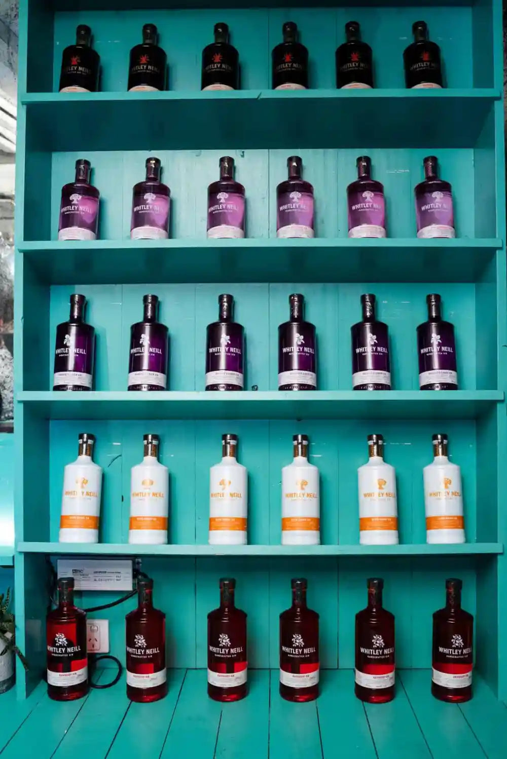
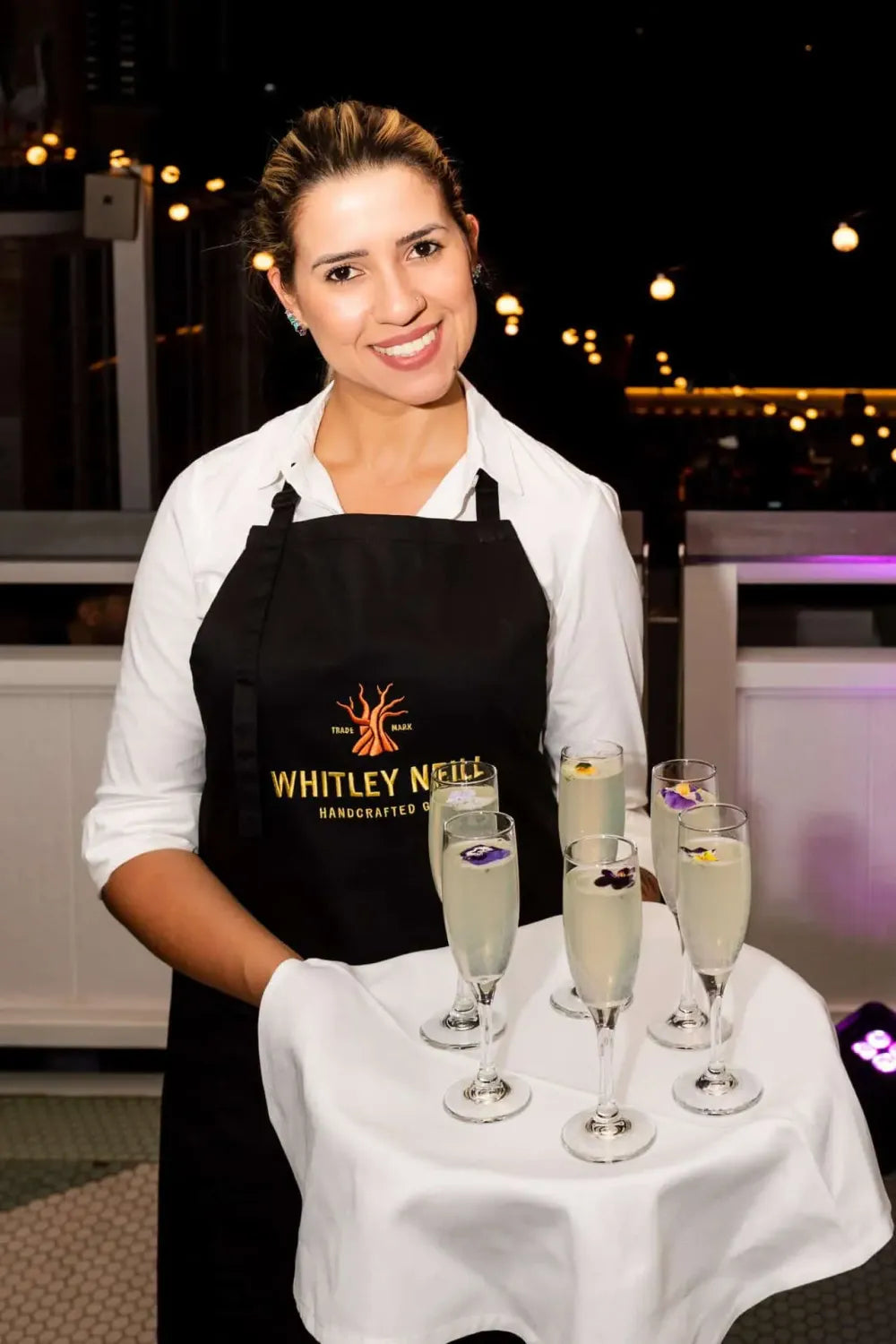
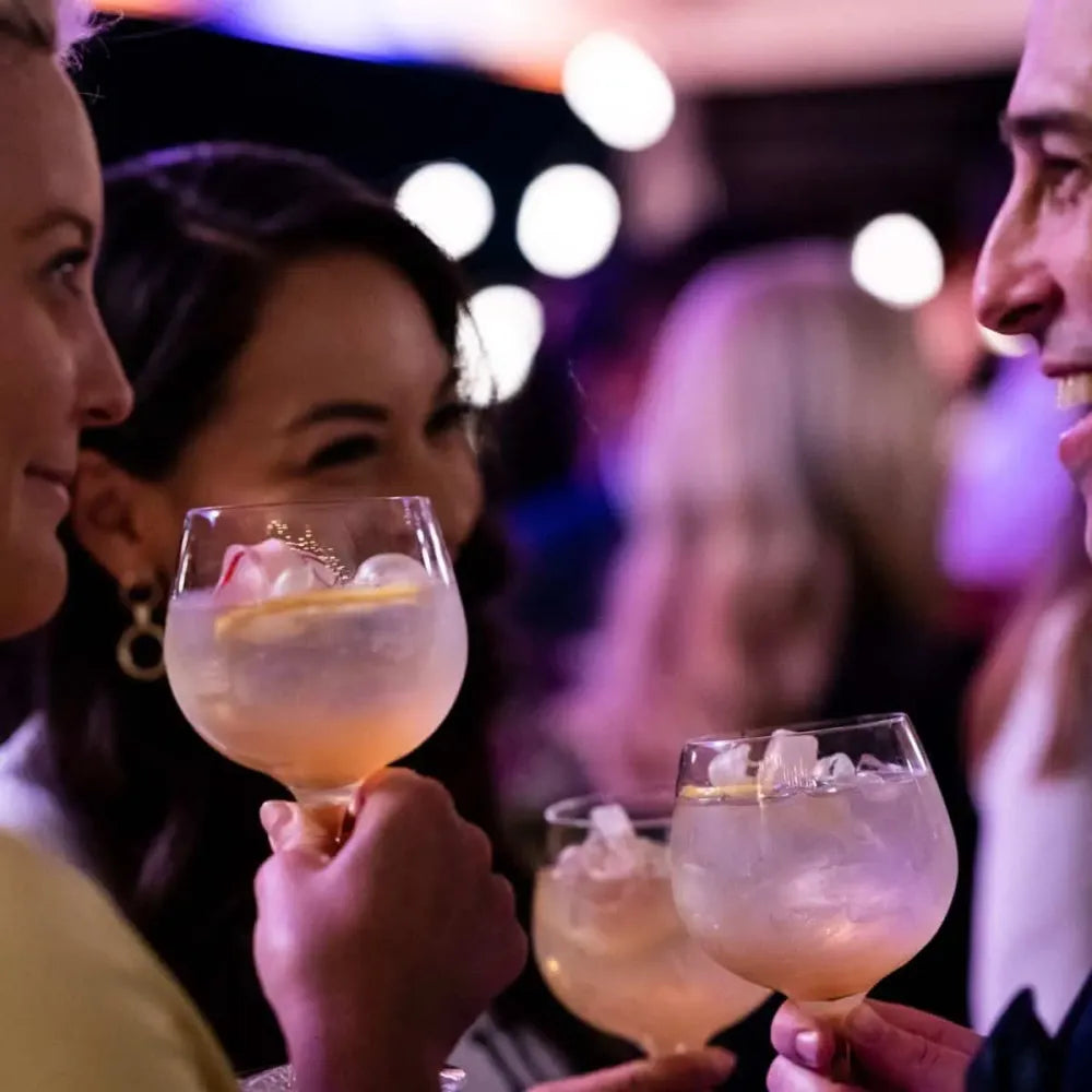
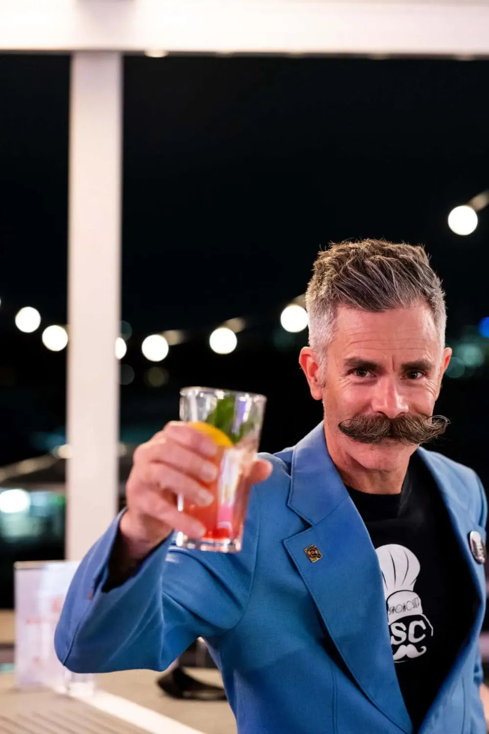
We recently had the pleasure of designing floral scenes for Whitley Neill Gin's launch event at Watson's Bay Boutique Hotel, and—at the risk of having you think we only design floral arrangements when cocktails are involved—we can't wait to share some photos of how it all turned out.
The launch party was definitely a high-stakes event. Think of a red carpet premiere for a movie—that's what this meant for the Whitley Neill brand. This was the coming out party for several new flavours, and the guest list was full of influential people connected to loyal audiences. The idea was to bring to life a series of floral moments that would serve as a visual version of the flavours guests were tasting for the first time.
Understanding Our Client
As always, great design work starts with getting to know our client—and in this case, their product line as well.
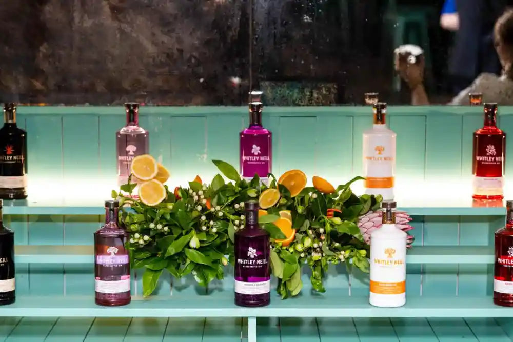
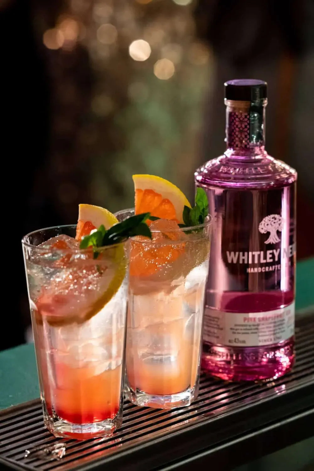
Whitley Neill Gin is crafted in an antique copper pot by Johnny Neill, an eighth generation distiller whose family has been making gin since 1762. For the launch party, the company needed some dazzling vignettes and a media wall to highlight all the amazing fruits and botanicals that make their gins unique. We found their handcrafted approach and attention to detail inspiring, so knew we had a kindred spirit to work with—something that always makes the job more fun!
We also knew the event had to be a knockout. First, the location is a truly special one. Watson's Bay Boutique Hotel is a stunning location overlooking Sydney Harbour. It's super-popular with Instagrammers and influencers, and the whole point of the launch was to get the smart set talking about the Whitley Neill brand. After all, there's no such thing as a private party anymore: guests would be snapping photos and posting on social media throughout the night, so it was important to create a backdrop that was visually lush and hinted at the flavour and craftsmanship of the new gins.
So the launch wasn't just a cocktail party. It was meant to be a full experience of what Whitney Neill is all about.
In this case, botanicals aren't just an accent to the brand. They are the brand.
The Challenge
When Light Year Productions, a leading event production agency, asked Fig & Bloom to design and install floral vignettes for the Whitley Neill Gin launch party, they presented us with a detailed, complex project brief. This wasn't just a list of centrepieces—they needed a full media wall, five floral vignettes that highlighted the flavours of each gin, and onsite delivery and installation. They also had a very specific list of items to include in each piece to represent their ingredients. Light Year also let us know that they had approached several other florists about the project, but that none had been able to meet the requirements they had envisioned for the project.
But we took one look and knew that this was the perfect project for us.
We had recently done similar work for Sweet & Chilli, a specialist drinks agency that offers bar services that turn events into incredible experiences. Food and flowers go hand and hand, and if it grows, we can turn it into a work of art.
So what made this project so challenging?
Whitley Neill is all about their ingredients. Each gin is a carefully balanced blend that features a main flavour as well as complementary notes from herbs, spices, and other botanicals. Whitley Neill is a London gin with South African roots, so many of their ingredients are local to Africa, which made sourcing the materials for our floral vignettes quite challenging. For example, getting gorgeous rhubarb stalks that still had their leaves intact took several tries. It was important to the client that all of the botanicals represented their top-notch ingredients in all their glory, but most grocers—understandably!—don't actually care about the rhubarb leaves, which are inedible. We never shy away from a challenge, and we ended up making it work.
But enough about us. Take a look at the results!
The Media Wall
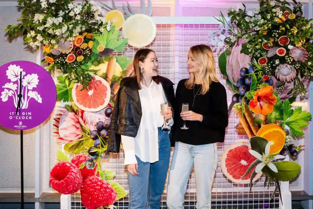
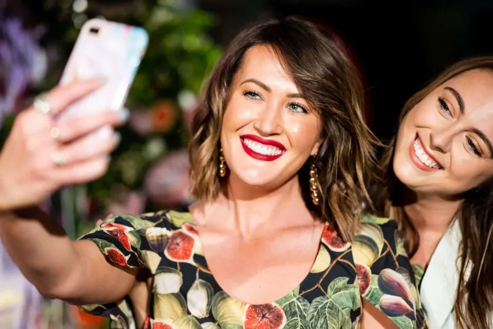
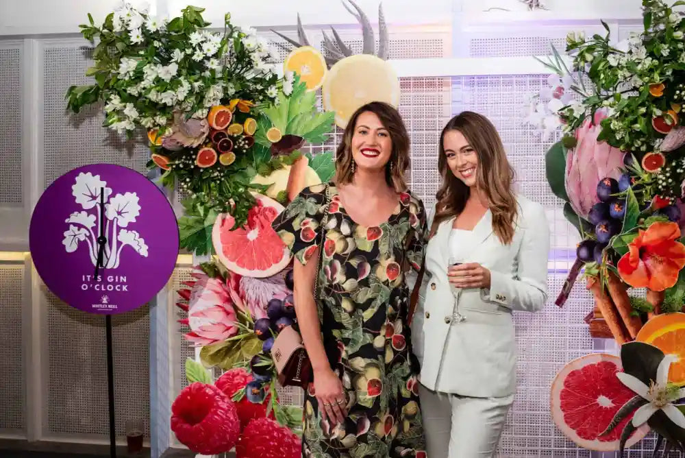
The media wall was designed to serve as a backdrop for photos, and it was the biggest piece of the launch party project. We knew it would be the most lasting part of the design, since it would show up in everyone's gin selfies and in any print articles, blog posts, or other reporting on the launch. Most of our work is ephemeral, but the media wall would live on via Instagram and the photographic record of the event.
The media wall is also where all the design elements from the evening came together in one overarching scene. It features all the major ingredients of the Whitney Neill Gin flavours being launched, and we added some stunning pink King Protea flowers as a nod to the brand's African origins. (We also just love King Protea's sculptural good looks, and the colour blended perfectly with the pink grapefruit slices nearby.)
We knew to expect a 2m x 2m wall with wire and mesh, but we hadn't seen the actual structure until we arrived on the scene to install the flowers. The team at Light Year attached their 2D fruit cut-outs—they look shockingly real in the photos!—and then we used cable ties to add our large floral designs. We pre-built these offsite by filling wooden boxes with a base medium and then adding alstroemeria, hypericum, and plenty of daisies. Once all the major pieces were secured to the wire wall, we added slices of fresh citrus and whole raspberries, which were lined up on long barbecue skewers to make them easier to work with. These functioned beautifully, just like oversized picks or hatpins with quite unusual jewels.
Once we stopped back and looked at the work, we filled in any bare spots with additional flowers and greenery. This was an iterative process, since we were only just seeing the space and the wall for the first time. That type of on-the-spot work is a lot of fun, though, and we definitely enjoyed ourselves putting it all together!
The Floral Vignettes
At the launch party, each flavour of gin was to be featured on its own stand. The floral design grew from each gin's unique ingredients. Light Year sent us a reference photo showing the white disc background and providing a sense of the cut-outs they would provide and the general feeling that they wanted a mix of flowers and fruits surrounding each bottle of gin.
From there, we researched the flavour profile of each gin in detail. That meant looking up each fruit or botanical and learning how it grows, what he fruits look like on the plant, etc. (Yes, we're total botany nerds!) This was hugely inspiring and helped us visualize how each vignette would come together. Here's what we came up with:
Original Flavour
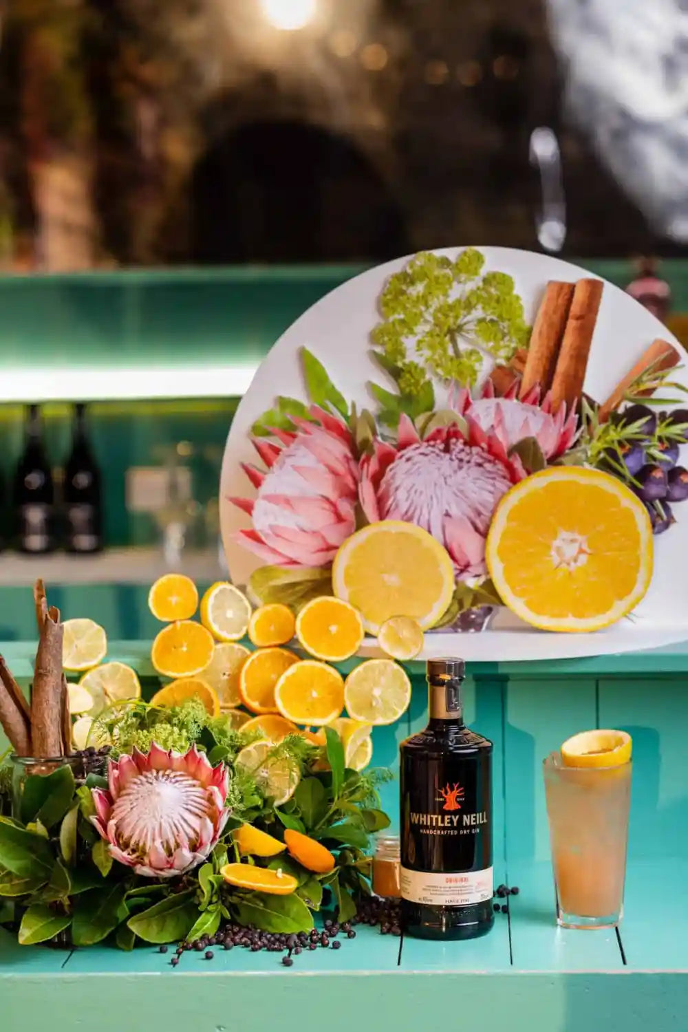
This vignette was designed to tell the origin story of Whitney Neill Gin. In keeping with its “Out of Africa” flavour, we wanted to include African plants along the large variety of ingredients and herbs that make up this special liquor. You see again a King Protea as the focal point, along with Queen Anne's lace to represent the many botanical ingredients. Because there are so many ingredients in this gin, balance was key in the design. We made sure that no single element dominated over the others.
One of the more unusual elements of this vignette is cassia bark, the rounded wooden “sticks” you see arcing out of a glass to the left of the arrangement. Cassia bark comes from the cinnamon tree and adds a distinct richness to the gin that helps tie all the other flavours together. This was a fun item to work with!
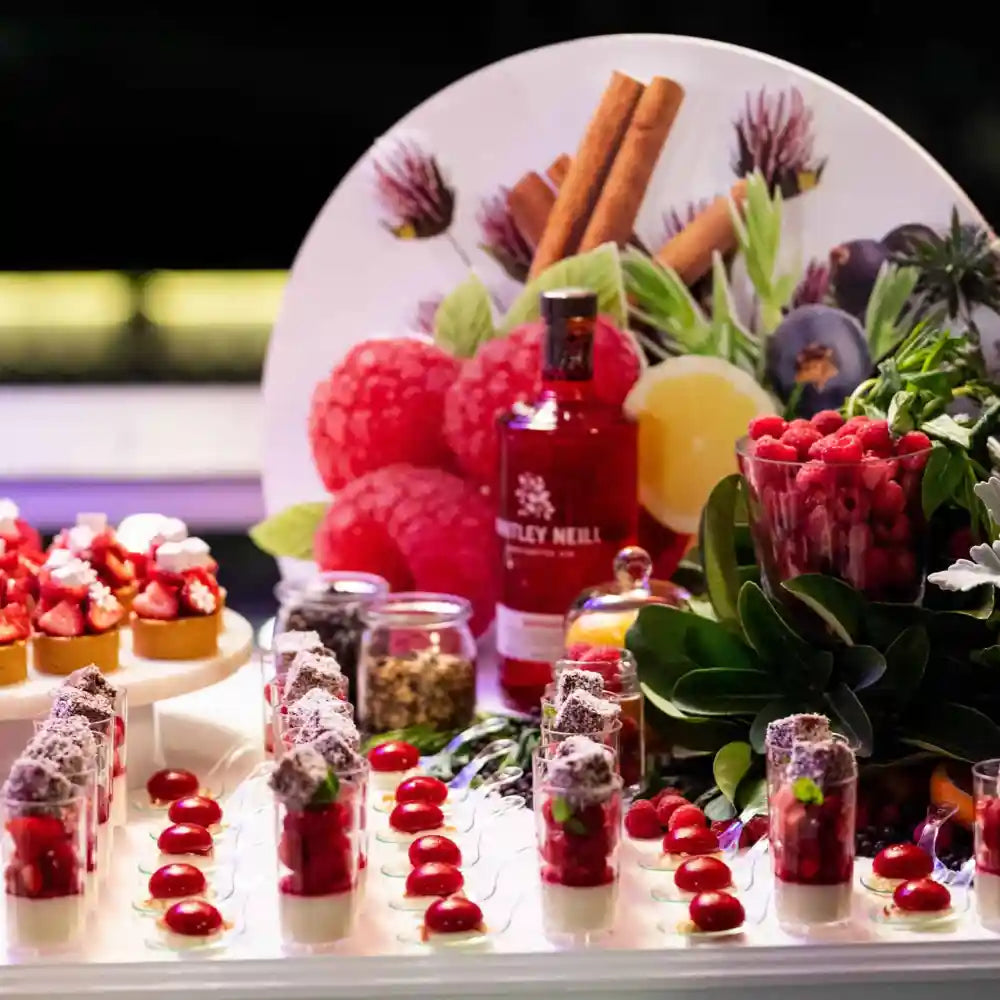
We also added plenty of orange and lemon slices to represent the citrus elements of Original Flavour. And, of course, there are juniper berries scattered about as well. Frosty blue juniper berries are the foundational ingredients of all gin, so we made sure they were featured here and in all the vignettes. We used them to carpet each stand and help the vignette blend seamlessly into its surroundings.
Raspberry Flavour
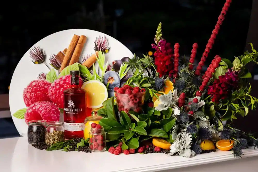
Raspberries are so small and delicate, so we had to have a long think about how to showcase the star ingredient without it getting lost in the shuffle. This piece led us to the skewers I mentioned earlier. I came up with that concept to create height and showcase the unique shape of the berry. We also added some raspberry pink snapdragons to further accentuate the berry skewers.
There were several unusual ingredients in this gin, including orris root, which is the root of the iris flower. orris root, juniper berries and more raspberries are also features in specimen jars. There's also dusty miller and sea holly, which is a nod to what tiny raspberries look like on their canes before they ripen.
Blood Orange Flavour
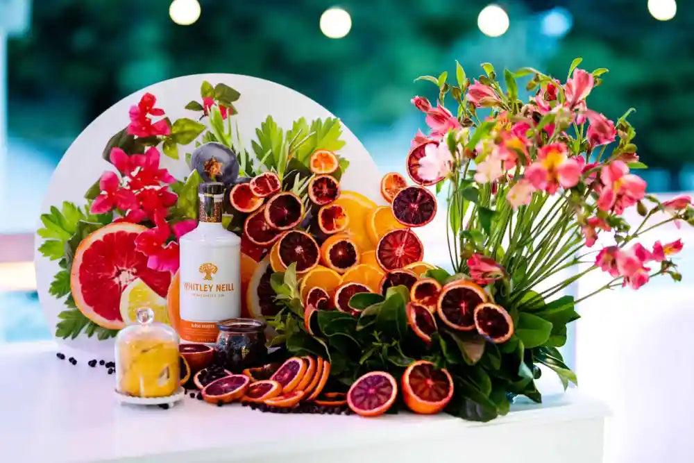
The tricky bit about blood oranges is that they look completely commonplace from the outside. It's only once you cut them open that they catch your attention. For this vignette, it was clear that we had to use slices of fruit to showcase the contrast of their rich interior with the much paler peel. We used the same skewering technique as we did for the raspberries, along with plenty of sliced fruit for the table.
Light Year let us know that they wanted a red cordial next to the bottle of gin to accentuate the deep colour of blood orange. To complement this palette, we chose vibrant alstroemerias as the floral component of the piece. Their slightly ruffled appearance provided a nice textural contrast to the more rigid geometry of the oranges.
Pink Grapefruit Flavour
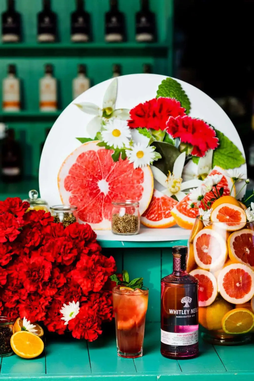
Pink grapefruit is very much like blood orange, in that all of its interest is on the inside. But we didn't want anyone to think we were a one-trick pony with our fruit skewering technique, so the challenge with this vignette was to come up with something substantially different from the others. To solve this problem, we used a large glass to hold the sliced grapefruit, which we arranged so that the slices faced outward for maximum impact. We also garnished the glass with daisies for a touch of whimsy.
To balance the heft of the grapefruit display, we added an equally robust arrangement of carnations to play off the grapefruit interiors. There are also small specimen jars filled with cassia bark, orris root, and coriander seed. Coriander plays a central role in the gin world, and is the second most used botanical after juniper. It is actually quite rare to find a gin that doesn't have coriander seed!
Rhubarb and Ginger Flavour
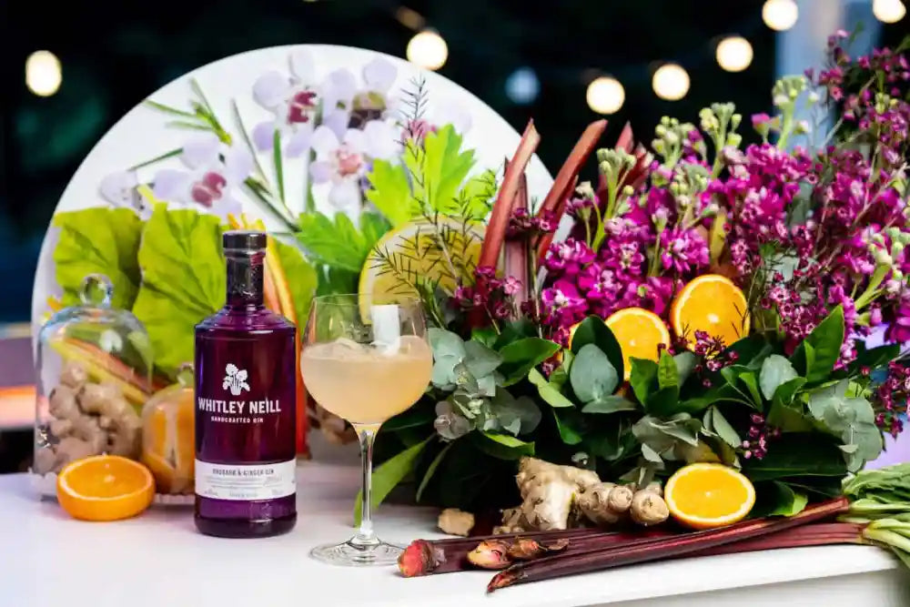
As mentioned earlier, sourcing rhubarb that was sturdy, ruby red, and still had its big, lush leaves was rather difficult to do. The client was clear from the outset about showcasing the full ingredient in each vignette, so we persisted until we found what we needed. In our design, the rhubarb was laid flat with the leaves cascading over the bench top. We also colour-matched the rich red of the rhubarb with deep maroon stock flowers. The whole colour scheme here was designed to accentuate the Whitney Neill Gin bottle for this flavour.
By contrast, ginger root was easy to find, and its interesting shape and texture made a nice contrast with the other elements. We used it throughout the vignette, particularly on the table and beneath a glass bell jar for a bit of Victorian drawing room flair. We also added some eucalyptus, which adds a bit of frostiness to complement the deep burgundy of the main elements.
The Reviews
We loved this project, and we really poured ourselves into the work. The result was a smashing success: happy guests, stunning florals, and a great launch pad for Whitley Neill's newest gins. Light Year was thrilled, saying the “floral styling was second to none!”
We can't wait for our next big event — will it be for you? We'd love to design something amazing for your guests, no matter what the occasion. Get in touch to let us know what we can create for you.

